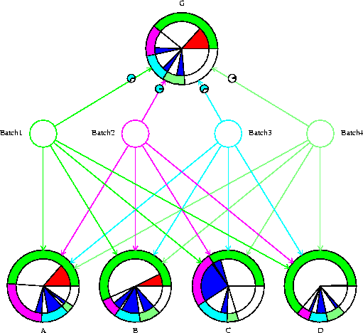
How should we interpret the influence diagram shown in
Figure 6? Only the path correlation circles shown on arcs
entering the G node are new features - the remainder we interpret as
described above. For example, examining the outer shadings reveals that
the
information source ![]() is expected to explain at least 50% of
the variance in each of the individual quantities excepting the
intercept C, for which
is expected to explain at least 50% of
the variance in each of the individual quantities excepting the
intercept C, for which ![]() also is a valuable
information source. Alternatively, for node D, the partial
adjustment by
also is a valuable
information source. Alternatively, for node D, the partial
adjustment by ![]() following an initial adjustment by
following an initial adjustment by ![]() isn't expected to contribute much more to variance resolution.
isn't expected to contribute much more to variance resolution.
Examining the diagnostic inner node shadings, we see mostly blue shadings, indicating smaller than expected changes in expectation. In particular, the change for node C induced by observing batch2 is very much smaller than expected. A few of the inner node shadings are red, but not so large as to indicate a serious contradiction between the belief inputs and the actual observations. The same can be said for the overall adjustment summary for the G node: there is an initial slightly larger than expected change in expectation due to observing the first batch; followed by three further diagnostically innocuous adjustments. The outer shadings for the G node suggest that each of the four batches contribute to the explanation of uncertainty across the collection G.
The small circles at the ends of the arcs drawn to the G node
represent path correlations between the sources of information.
These express the observed degree of
concordance between two composite information sources in determining the
revision of beliefs. Values near ![]() indicate that two
information sources are complementary: together they give
larger changes in belief than would be given by the sum of their
individual effects. Conversely, values near
indicate that two
information sources are complementary: together they give
larger changes in belief than would be given by the sum of their
individual effects. Conversely, values near ![]() indicate contradictory evidence, with some consequent cancelling out
of their respective changes in belief. We show the magnitude of
correlation by degree of shading of the small circle, and direction by
colour: light blue for positive, light red for negative. In
Figure 4, all the path correlations are positive.
Respectively, they are 0.69, 0.97, 0.66, and 0.07. Thus, for example,
the information in batch4 is only weakly related to the information
carried by the other three batches taken together.
indicate contradictory evidence, with some consequent cancelling out
of their respective changes in belief. We show the magnitude of
correlation by degree of shading of the small circle, and direction by
colour: light blue for positive, light red for negative. In
Figure 4, all the path correlations are positive.
Respectively, they are 0.69, 0.97, 0.66, and 0.07. Thus, for example,
the information in batch4 is only weakly related to the information
carried by the other three batches taken together.