R Techniques 8: Advanced Plots
1 Advanced plots
1.1 Customising plots
Many high level plotting functions (plot,
hist, boxplot, etc.) allow you to include
additional options to customise how the plot is drawn (as well as other
graphical parameters). We have seen examples of these already with the
axis label arguments xlab and ylab, however we
can customise the following plot features for finer control of how a
plot is drawn.
1.1.1 Axis limits
To control the ranges of the horizontal and vertical axes, we can add
the xlim and ylim arguments to our original
plotting command. To set the horixontal axis limits, we pass a vector of
two numbers to represent the lower and upper limits,
xlim = c(lower, upper), and repeat the same for
ylim to customise the vertical axis.
plot(x=mtcars$wt, y=mtcars$mpg, xlab="Weight", ylab="MPG",
     main="MPG vs Weight", xlim=c(0,6), ylim=c(0,40))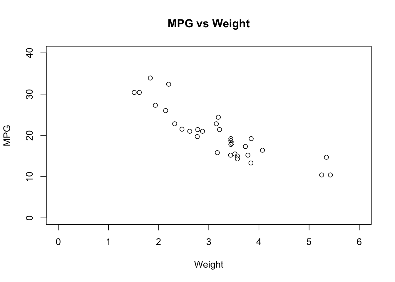
1.1.2 Colour
Using colour in a plot can be very effective, for example to
highlight different groups within the data. Colour is adjusted by
setting the col optional arugment to the plotting function,
and what R does with that information depends on the value we
supply.
colis assigned a single value: all points on a scatterplot, all bars of a histogram, all boxplots are coloured with the new colourcolis a vector:- in a scatterplot, if
colis a vector of the same length as the number of data points then each data point is coloured individually - in a histogram, if
colis a vector of the same length as the number of bars then each bar is coloured individually - in a boxplot, if
colis a vector of the same length as the number of boxplots then each boxplot is coloured individually - if the vector is not of the correct length, it will be replicated until it is and the above rules apply
- in a scatterplot, if
Now that we know how the col argument works, we need to
know how to specify colours. Again, there are a number of ways and you
can mix and match as appropriate
- Integers: The integers
1:8are interpreted as colours (black, red, green, blue, …) and can be used as a quick shorthand for a common colour. Typepalette()to see the sequence of colours R uses. - Names: R recognises over 650 named colours is
specified as text, e.g.
"steelblue","darkorange". You can see the list of recognised names by typingcolors(), and a document showing the actual colors is available here - Hexadecimal: R can recognise colours specified as
hexadecimal RGB codes (as used in HTML etc), so pure red can be
specified as
"#ff0000"and cyan as"#00ffff". - Colour functions: R has a number of functions that
will generate a number of colours for use in plotting. These functions
include
rainbow,heat.colors, andterrain.colorsand all take the number of desired colours as argument.
## 3 plots in one row
par(mfrow=c(1,3))
## colour the cars data by number of gears
plot(x=mtcars$wt, y=mtcars$mpg, col=mtcars$gear, xlab="Weight", ylab="MPG",
     main="MPG vs Weight")
## manually colour boxplots
boxplot(mpg~cyl, data=mtcars, col=c("orange","violet","steelblue3"),
        main="Car Milage Data", xlab="Number of Cylinders",
        ylab="Miles Per Gallon")
## use a colour function to shade histogram bars
hist(mtcars$mpg,col=rainbow(5))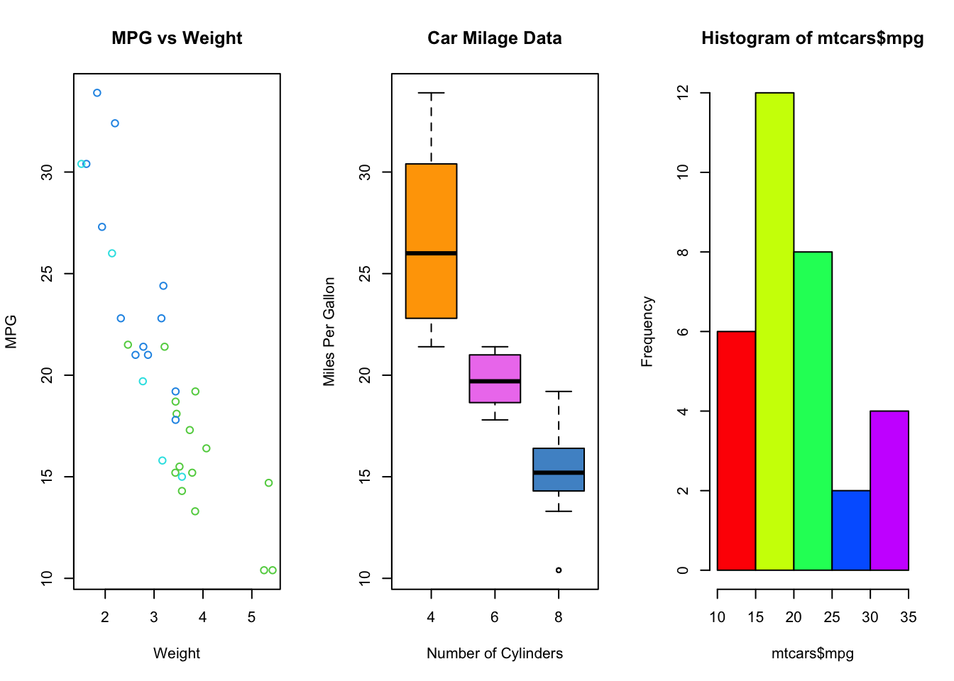
R Help: colors, palette, color functions
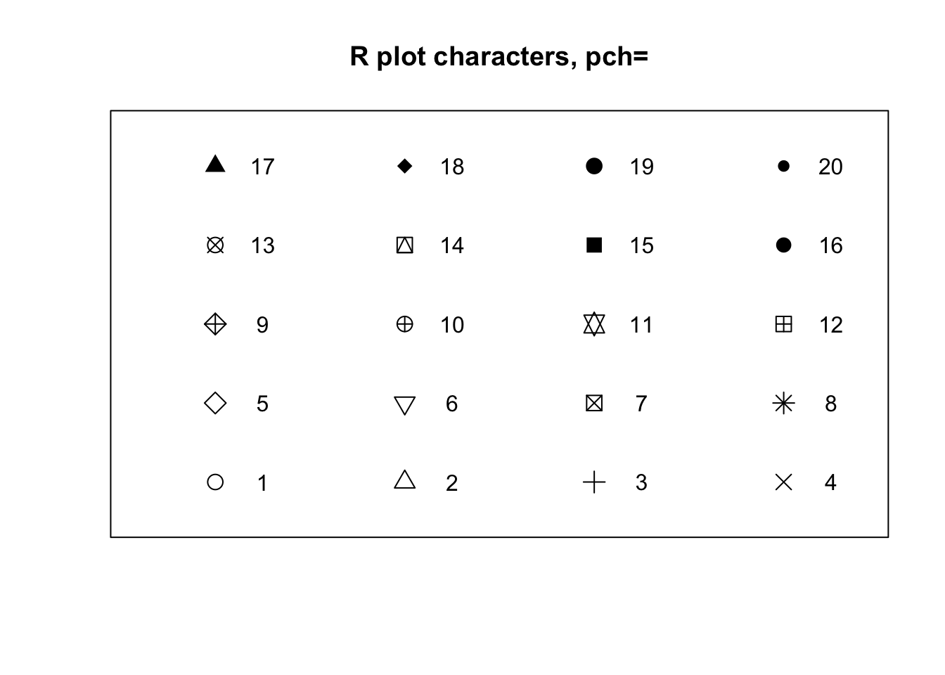
1.1.3 Plotting symbols
The symbols used for points in scatter plots can be changed by
specifying a value for the argument pch {#pch} (which
stands for plot character). Specifying
values for pch works in the same way as col,
though pch only accepts integers between 1 and 20 to
represent different point types. The default is pch=1 which
is a hollow circle. The possible values of pch are shown in
the plot below:
1.1.4 Lines
When drawing plots with lines instead of points, we can customise the
line style by specifying the line width and line type. Line width is
specified by lwd {#lwd} (for line
width) and is given a single numerical
value which is interpreted as the width of the line relative to the
default width of lwd=1. So, lwd=2 produces
lines that are twice as wide.
Line types are specified via the lty {#lty} argument as
integers corresponding to 6 different line styles shown in the plot
below:
plot(1:6,axes=FALSE,ty='n',ylim=c(0,7),xlab='',ylab='',main='Line types, lty=')
abline(h=1:6,lty=1:6,lwd=2,col='forestgreen')
axis(2,at=1:6)
box()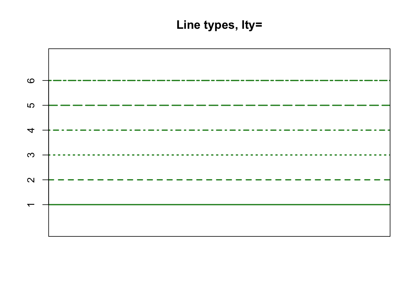
1.2 Adding to plots
Once we have created a plot using the methods above, we often want to add additional information, such as points, lines, or a legend.
1.2.1 Adding points
Additional points can be added to a plot using the
points function. It is used in the same way as
plot for drawing a scatterplot, but it can only add further
points to an existing plot.
For example, we can add the sample mean values as a red star to the plot of car weight vs miles-per-gallon
plot(x=mtcars$wt, y=mtcars$mpg, col=mtcars$gear, xlab="Weight", ylab="MPG",
     main="MPG vs Weight")
points(x=mean(mtcars$wt), y=mean(mtcars$mpg), col='red', pch=8)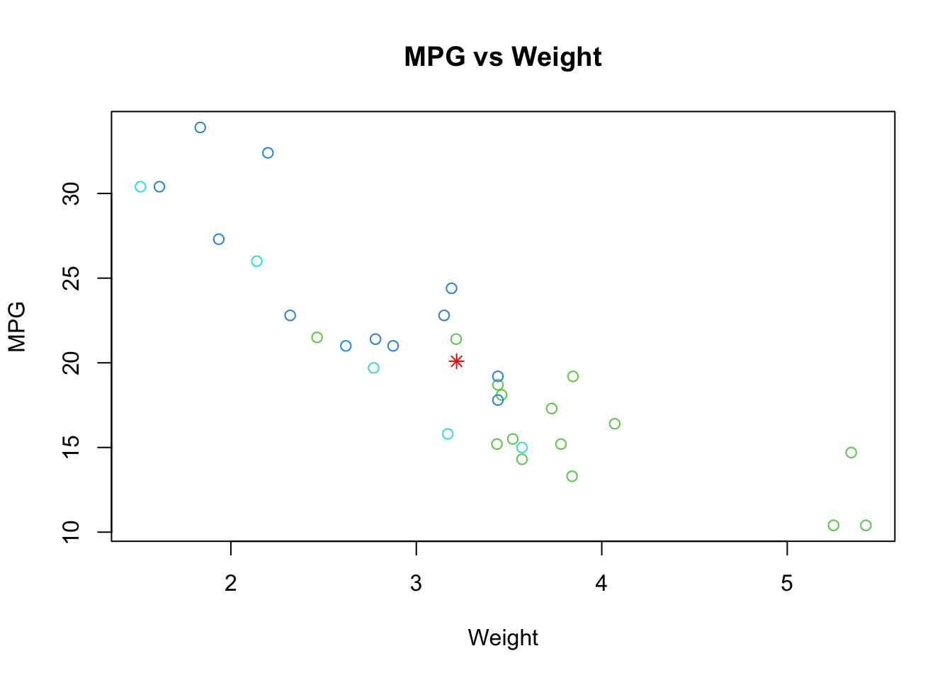
R Help: points
1.2.2 Adding lines
It is often useful to add simple straight lines to lines to plots,
which can be achieved using the abline function.
abline can be used in three different ways:
- Draw a horizontal line: pass a value to the
hargument,abline(h=3)draws a horizontal line at \(y=3\) - Draw a vertical line: pass a value to the
cargument,abline(v=5)draws a vertical line at \(x=5\) - Draw a line with given intercept and slope: pass value to the
aandbarguments representing the intercept and slope respectively;abline(a=1,b=2)draws the line at \(y=1+2x\)
abline {#abline} can be customised using any of the
colour and line modifications discussed above.
plot(x=mtcars$wt, y=mtcars$mpg, col=mtcars$gear, xlab="Weight", ylab="MPG",
     main="MPG vs Weight")
points(x=mean(mtcars$wt), y=mean(mtcars$mpg), col='red', pch=8)
abline(a=37.285, b=-5.344, col='red') ## line of best fit
abline(h=mean(mtcars$mpg), col='violet', lty=3) ## horizontal line through ybar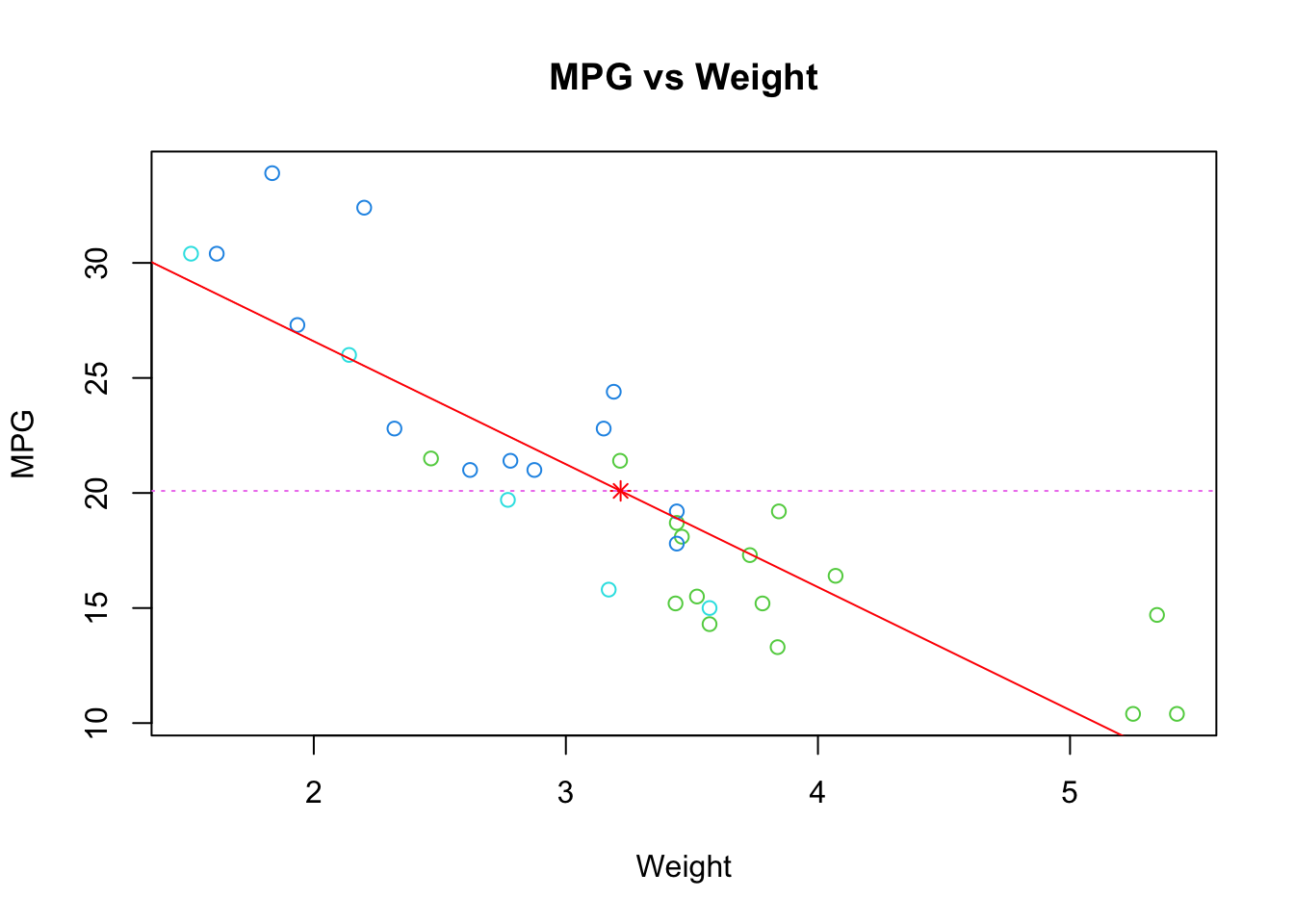
R Help: abline
We can also use R’s line drawing functions to add curves to
a plot via the lines {#lines} function, which works in
exactly the same way as point only drawing connected lines
rather than individual points. To add a function \(f(x)\) to a plot, we must first construct a
vector of \(x\) values over the range
of the plot, and then evaluate the function \(f\) at each of them. We can then supply
both vectors to lines as x and y
and it will connect the points and draw the function on the current
plot.
For example, suppose we generate 500 random values from a standard
normal distribution. We can plot their histogram via hist,
but we can also use dnorm to evaluate the standard normal
pdf and add it to the plot using the lines function:
randvals <- rnorm(500)
hist(randvals,freq=FALSE, ylim=c(0,0.45)) ## freq=FALSE to plot the density
xs <- seq(-5,5,length=500) ## make a sequence of x values
ys <- dnorm(xs) ## evaluate the N(0,1) pdf at each x value
lines(y=ys,x=xs,col='red') ## plot the values as connected lines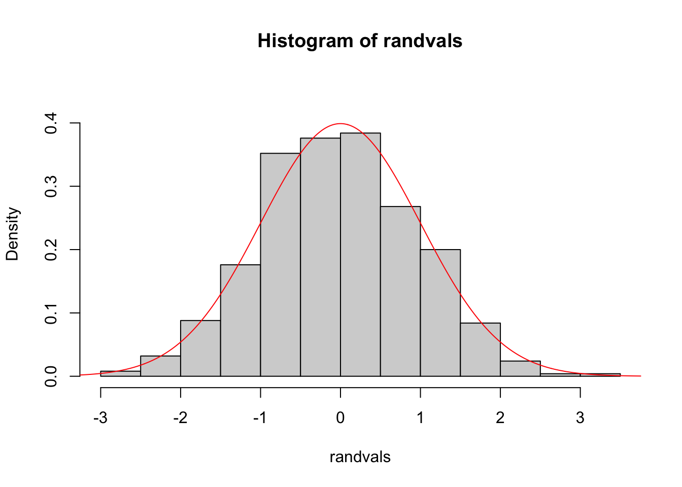
R Help: lines
1.2.3 Adding text
In the same way as points and lines can be added to a plot, text
annotations can be drawn on plots using the text function.
Again, we must specify the x and y location(s)
but now we must also supply the text to be drawn at each point via the
labels argument. Text size can be adjusted by the
cex argument, and the position of the text relative to the
point specified can be adjusted by the pos argument.
plot(x=mtcars$wt, y=mtcars$mpg, main="Milage vs. Car Weight",
    xlab="Weight", ylab="Mileage", pch=18, col="blue")
text(x=mtcars$wt, y=mtcars$mpg, labels=row.names(mtcars), cex=0.6, pos=4, col="red")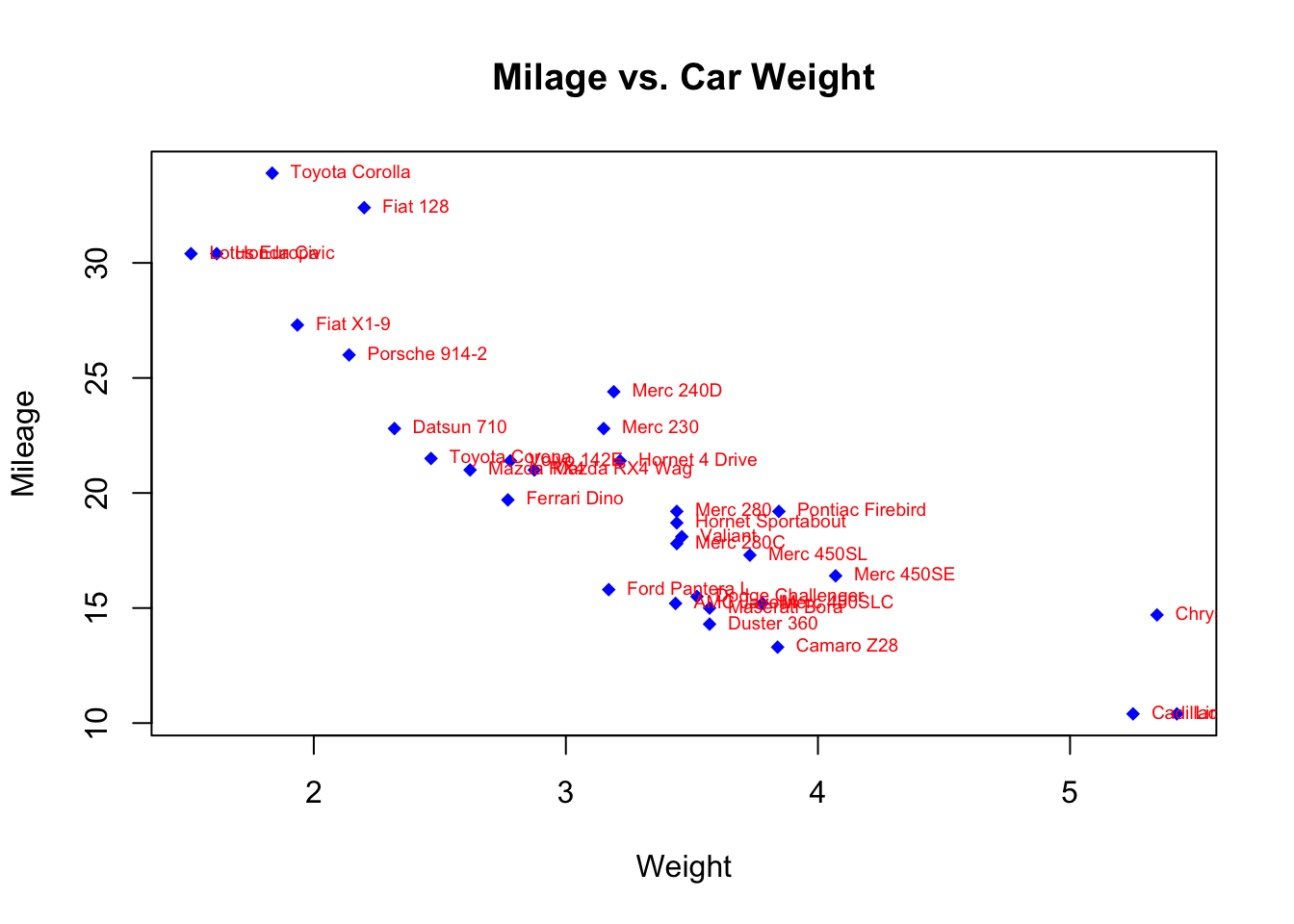
R Help: text
1.2.4 Adding a legend
The legend function adds legends to plots
legend(location, legend, ...)The required arguments are:
location: There are several ways to indicate the location of the legend. You can give anx,ycoordinate for the upper left hand corner of the legend. Often, it is easier to use one of the keywords"bottom","bottomleft","left","topleft","top","topright","right","bottomright", or"center".legend: A character vector with the labels for each item in the legend.
The legend function takes a number of optional
arguments:
...: Other optional arguments to display in the legend to match each of the labels. If the legend labels colored lines, specifycol=and a vector of colors. If the legend labels point symbols, specifypch=and a vector of point symbols. If the legend labels line width or line style, uselwd=orlty=and a vector of widths or styles. To create colored boxes for the legend, usefill=and a vector of colors.title: a title for the legend box.horizontal: display the legend items horizontally rather than vertically
boxplot(mtcars$mpg~mtcars$cyl, main="Milage by Car Weight",
    yaxt="n", xlab="Milage", horizontal=TRUE, col=terrain.colors(3))
legend("topright", title="Number of Cylinders", legend=c("4","6","8"), fill=terrain.colors(3), horiz=TRUE)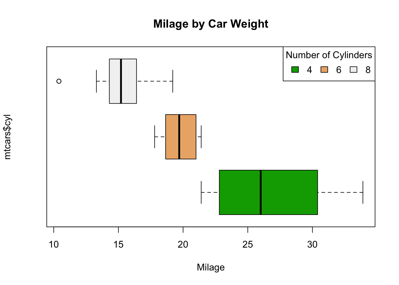
R Help: legend